ShopDreamUp AI ArtDreamUp
Deviation Actions


Suggested Deviants


Suggested Collections


You Might Like…


Featured in Groups


Description
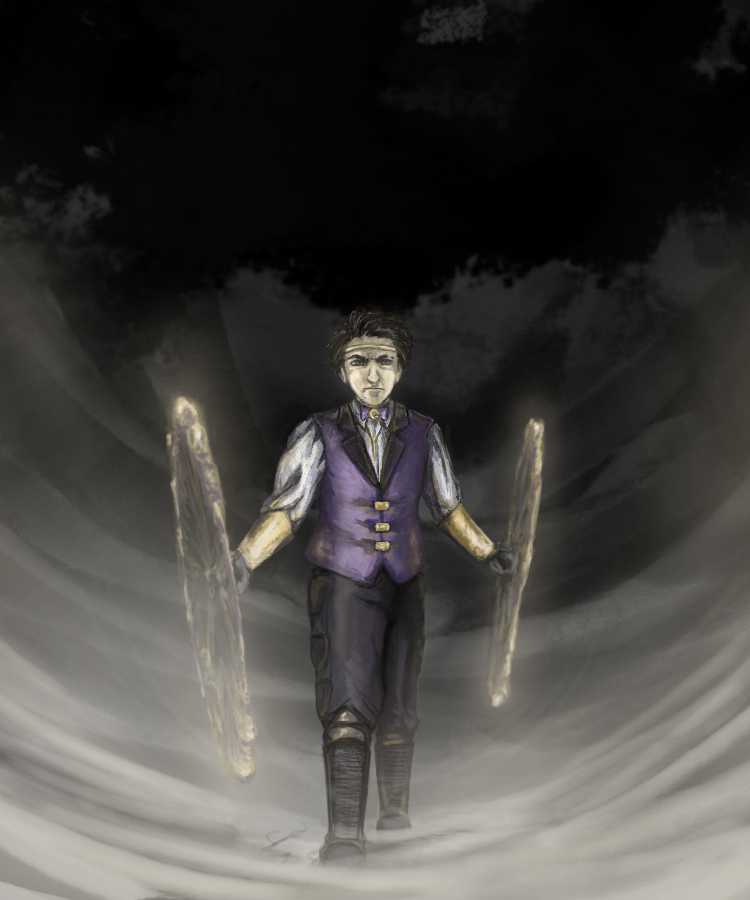
Here's another go at  's and my qualification entry for
Feedback again, please? I feel like he looks way older than I intended (it might be that damn nose), and I think there's something wrong with the left leg (the forward one). As before, any comments on color, composition, etc. are welcome as well.
Thanks and enjoy!
Soldier Orcus belongs to QA, but I'm allowed to abuse him
's and my qualification entry for Feedback again, please? I feel like he looks way older than I intended (it might be that damn nose), and I think there's something wrong with the left leg (the forward one). As before, any comments on color, composition, etc. are welcome as well.
Thanks and enjoy!
Soldier Orcus belongs to QA, but I'm allowed to abuse him
Image size
750x900px 291.84 KB
Comments8
Join the community to add your comment. Already a deviant? Log In
He TOTALLY looks ready to kick some ass!
That said, critique time woooo! You're the only person I ever do actual critiques for haha.
Vision - I feel like he's walking through mist that is being pushed away by his poi, is that about right? If so you did a splendid job of conveying that feeling.
Originality - Orcus is a very original character from QuixoticApricot, and I love the design you helped to make for him. Not a tuxedo-whatsis or Something-Knight. He's his own badass self.
Technique - Here come the quirks first.
FACE: I do appreciate that he's totally focusing and pissed off about something. His determination is again showing really well in the set of his face. That said, there are too many lines in the shading - every additional line on a character's face ages them up by so many years. Smoother shading and coloring, and reduction of some of the lines may help to smooth him out and make him look younger.
The angle of his nose implies you're looking at him from above (can't see any hint of nostrils) or his nose was flattened by a punch a good while back.
His eyes are a liiiiiittle too big I think. It's hard to tell, but they are very close together - right on the sides of his nose. I am unsure of QA has described him as having close-set eyes, so it depends on how she wants him drawn of course. It may also just be the lines!
TORSO: His bowtie seems like it should be off center a little bit to follow the twisting of his torso as he walks. Along those lines, it's twisting the wrong way - you twist INTO the leg that is moving forward, not away from it. I feel like there are a few other foreshortening issues (the line of his vest implies almost a straight-on look but his right side is larger/closer to the viewer, while his left shoulder is trying to be both behind the line of his hip AND in front of it?).
LEGS: The way his feet are on about the same line in the distance makes it muddled on if he's standing in one place or walking. His stance should be more wide spread and his rear foot would need to be at a very slight angle away from his body for stability if he was standing still, and his feet would still be angled out more if he was walking forward. His rear foot would bend more, the knee would be bent more, you'd see more top of foot instead of an angle that implies you are on level with his feet.
His pants are different! They're missing the chap look. His crotch looks different.
Weird note: his shins seem kind of short. Like his calves and shins are shorter in proportion to his thighs. If he is walking uphill, which I'm not entirely sure of, they WOULD be shortened, but his knees woudl be bent more and his back foot would disappear more on the vanishing line I think. He'd also lean into his right leg more and have a more exaggeratedly bent torso.
The shadows on his sleeves are very dark and thick adding a lot of weight to the cloth; are they meant to be puffy and light, or heavy and thick?
That's about all I have to critique.
Positives!!
I love the background and the image. your coloring is much better as far as color choices and making him pop in the grayer tones of the background. The poi have an amazing, almost glow effect, and it definitely looks like a still photo of someone twirling poi at high speed. Nicely done! It definitely looks like he's got some reflections/shading off of the glow of the poi on the shiny parts of him (skin, metal bits), so that looks pretty awesome.
Overall the proportions look great besides what I noted above. He definitely looks like a large man; only the shortened shins make him look a bit stocky (which I did note before, he looked a little thick).
Phew - this was a long critique! I'm so sorry. T____T